MICHAEL HARTMANN • GRAPHIC DESIGNER
Riverside, California
Click on a category below to view samples of my design work.
Riverside, California
Click on a category below to view samples of my design work.
Illustrations made with Adobe Illustrator.
Most elements were drawn with the pen tool. No trace features or artificial intelligence were used.
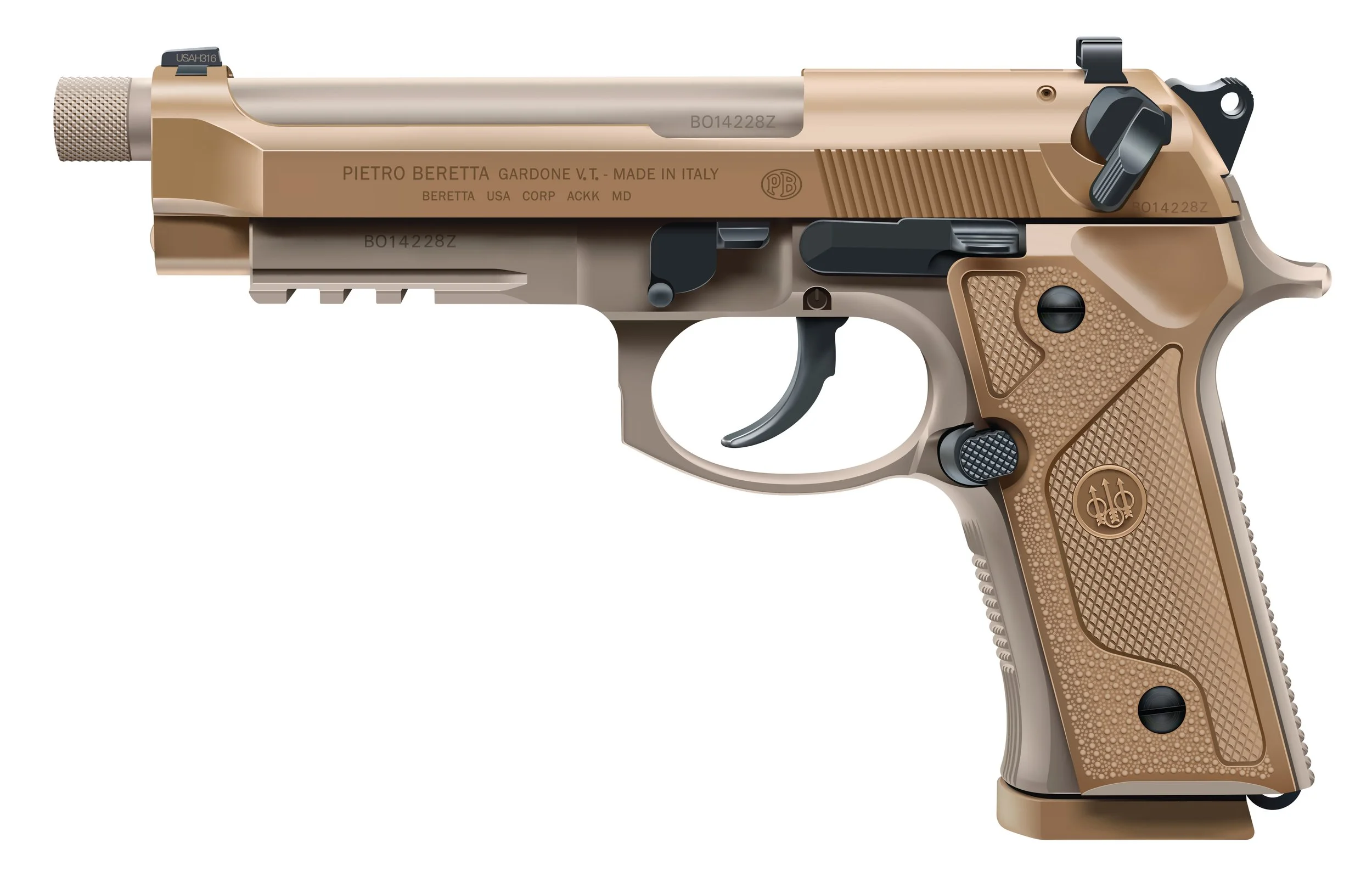
I am not affiliated with Beretta in any way. All trademarks and copyrights, if applicable, are the property of their respective holders.
Spyderco Police 4 Black knife drawing, v1, August 2025.
Spyderco Police 4 Black knife drawing, v2, August 2025.
Drawings made with Adobe Illustrator
I use the pen tool for the majority of my Illustrator drawings and elements within. None of the drawings showcased here were made with Live Trace or Artificial Intelligence.
Eotech® XPS2 line drawing.
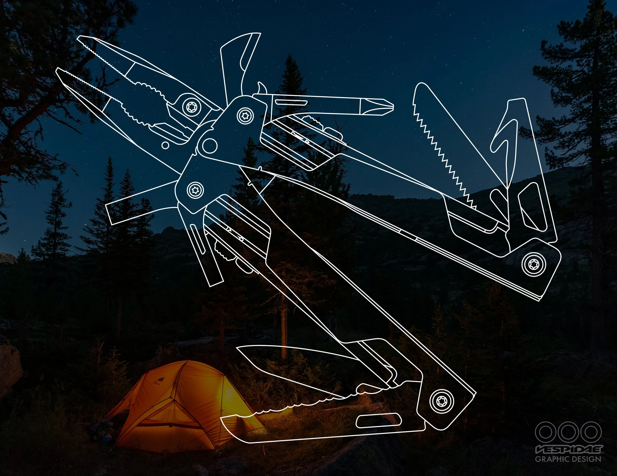
Leatherman® OHT® multi-tool line drawing.
Spyderco® Police 4 line drawing, August 2025.
Spyderco® Police 4 line drawing, August 2025.
Spyderco® Police 4 drawing, August 2025.
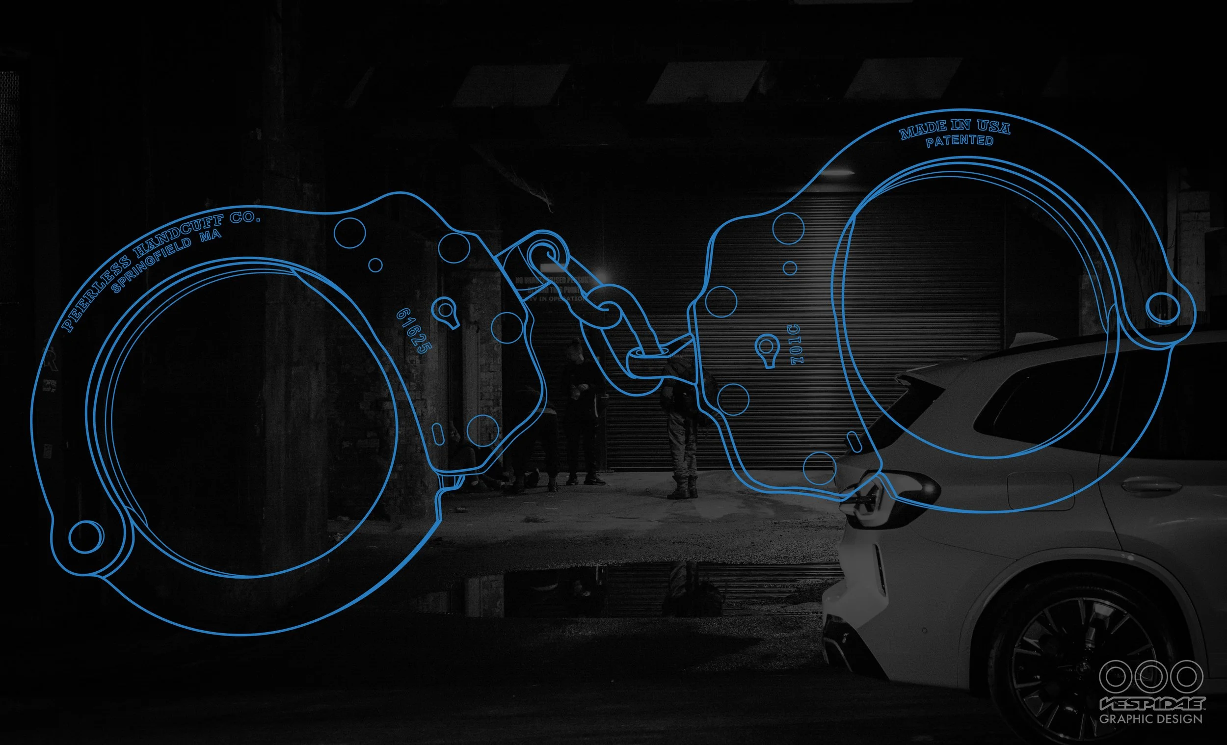
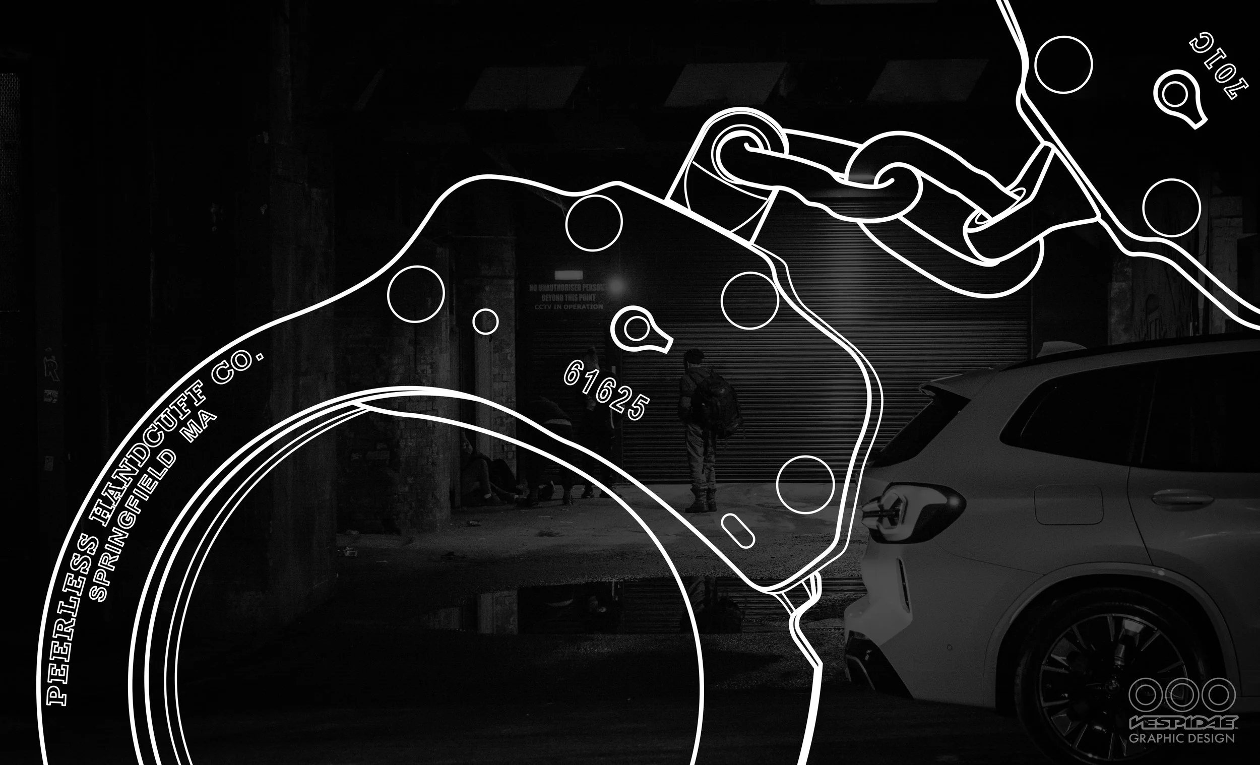
Peerless® handcuffs line drawing, August 2025.
Peerless® handcuffs line drawing, August 2025.
Peerless® handcuffs line drawing, August 2025.
Cold Steel® Trench Hawk and SOG® Tactical Tomahawk line drawings (not to scale).
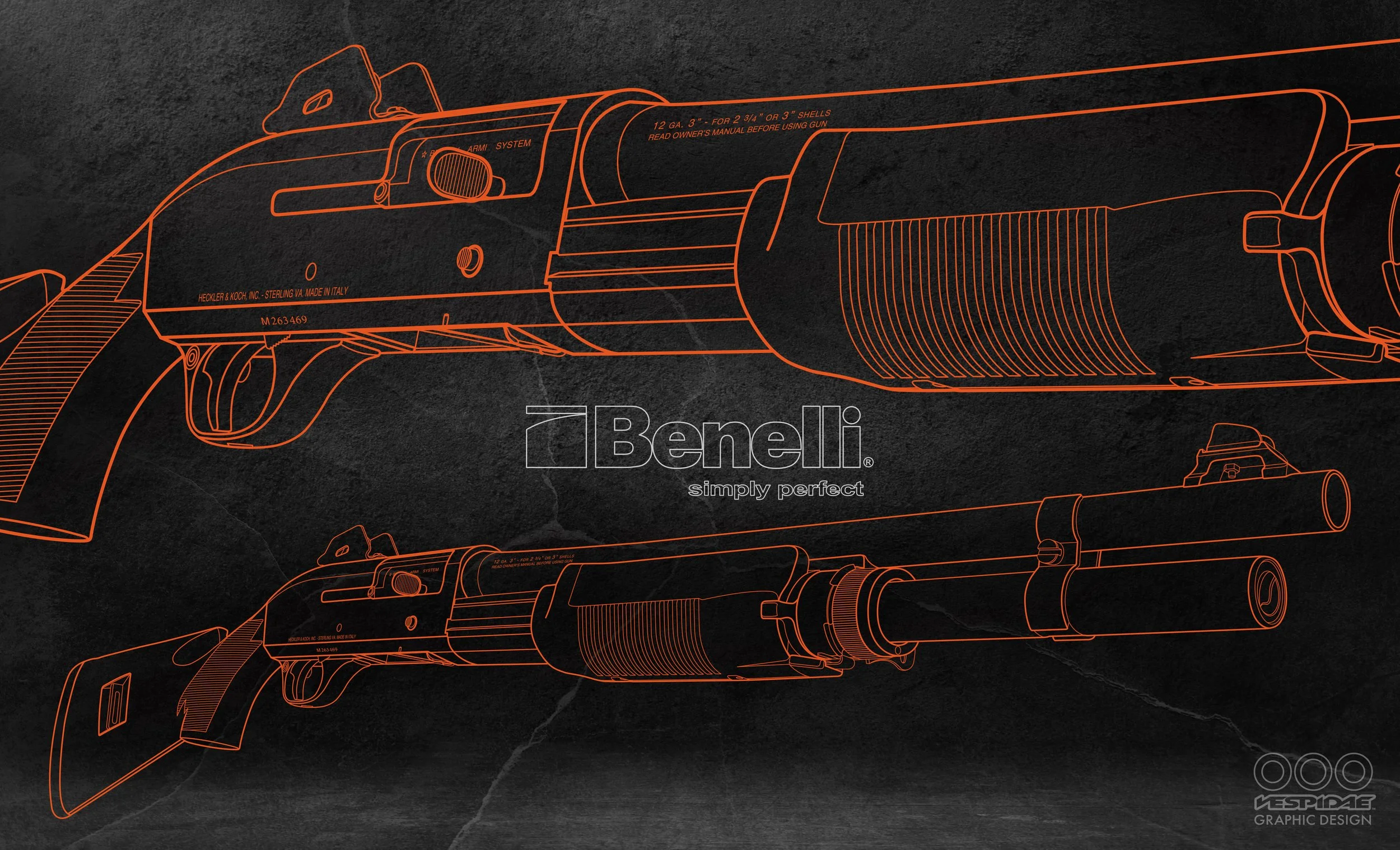
Benelli® M3 Super 90 shotgun line drawing. A photo of the shotgun was used as a guide on the bottom layer when drawing with the pen tool. I had seen a similar technical-type drawing in a magazine and wanted to test myself to see if I could accomplish a similar feat.
The Benelli® logo is not my design; reproduced here to demonstrate skill.
Zero Tolerance® 0566 Hinderer Design folding knife line drawings showing open and closed.
All the elements I drew for my Fishing Infographic.
All the elements I drew for my Arfcom Infographic.
Drawings made with Adobe Illustrator
I use the pen tool for the majority of my Illustrator drawings and elements within. None of the drawings showcased here were made with Live Trace or Artificial Intelligence.
The snowflakes were purchased vector art; all else by me. And, it’s a Christmas movie. So there.
You dirt-eating piece of slime, you scum-sucking pig, you son of a motherless goat!
New fake dog food logo. Before the criticism and hate mail role in, know this: I’m a graphic designer, not some marketing genius.
Detroit Tank Arsenal emblem. So far as I know, the Arsenal never had an actual emblem. So, they do now.
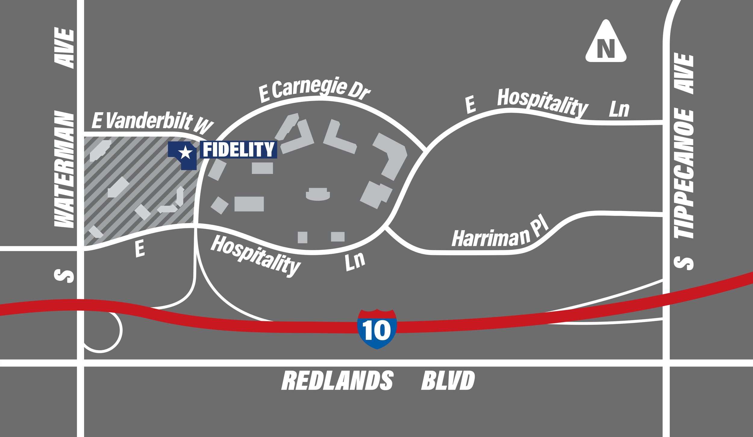
Map drawn for the office location page of a 20+ page booklet.
Fall and Halloween is my favorite time of year. I drew this a few years back and have recently done some improvements. All elements designed and drawn by me except the bats (stock art).
Firemen and chili go together like bread and butter.
Fun with Zippo, February 2019.
Robot Vodka beverage label. Because hell yeah, vodka and robots.
I’d like to clarify that this product is not vodka for robots, it’s simply called “Robot Vodka.” HERE'S a sample of what the Illustration looks like with Photoshop effects added.
A hard shadow drawing of Lee Marvin from the movie “The Dirty Dozen.”
Pumpkin bomb drawing made for my Consolidated Steel logo.
Although I put this one in “Illustration” it’s more of a reproduction, as the idea isn’t mine. I saw some stock art with a similar design and thought it would be fun to reproduce (the jack-o’-lantern is my design; trees are reproduced). The idea was to use it on the front of an invitation or flyer with a black field below the pumpkin for text.
“Cannonball Pool Service” emblem. Cannonball was a potential business name and I designed an emblem for fun and practice. It was never used.
My homage to the SureFire company. Their stuff is top notch!
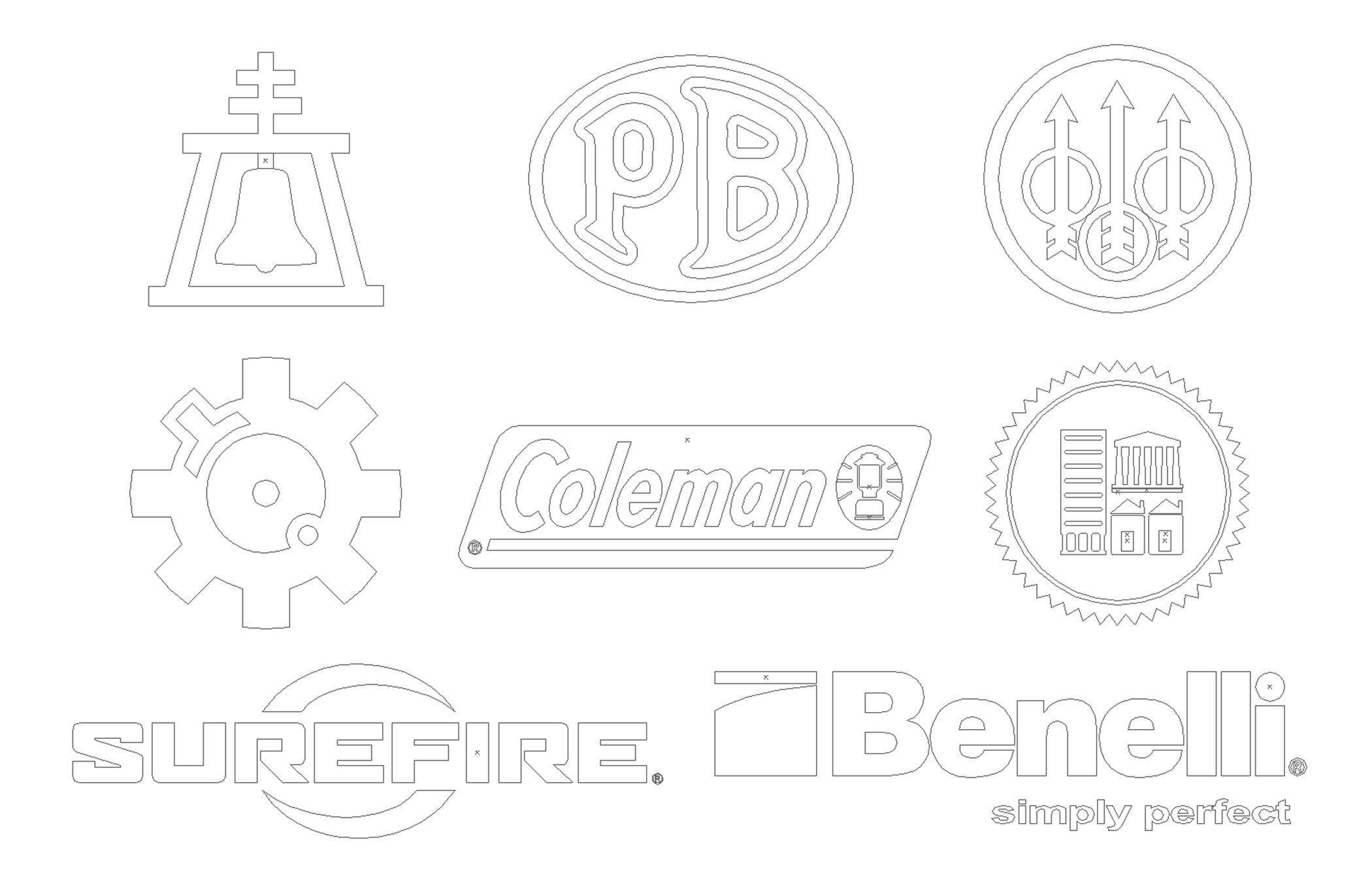
Drawings of existing logos, emblems, art, etc. using Adobe Illustrator. None of the logos/vector drawings displayed here were designed by me, and in no way am I attempting to take credit for the original idea or design in any way. These vector drawings are showcased here simply to demonstrate my ability to reproduce various designs, from scratch, using Adobe Illustrator, when an original vector file is needed but unavailable. All trademarks and copyrights, if applicable, are the property of their respective holders.
I needed this established logo in a vector format so I drew it out in Illustrator. I didn’t know what font was used for the word “Team” so I drew those letters, as well as the G in “Guy.” October 2022.
Work on the Coleman® logo in progress. The letters were drawn individually.
The completed modern Coleman® logo.
Finished version of the Riverside, California, police department shoulder patch and motor officer emblem. The word “POLICE” here is in Univers Bold but was altered considerably as it wasn’t an exact match for the original font. “RIVERSIDE” is unaltered Arial Bold, although that wasn’t an exact match either. I drew the Riverside “Raincross” emblem for another project years ago (not my design either). The “Wings & Wheel” emblem I drew based on a photo of an authentic RPD patch.
Patches with artwork and outlines view.
State of Sonora, Mexico, logo from the 1970’s.
U.S. Army Second Armored Division emblem from World War II.
Coiled "Don't Tread On Me" rattlesnake from the cover of the Metallica "Black Album."
In-N-Out burger logo.
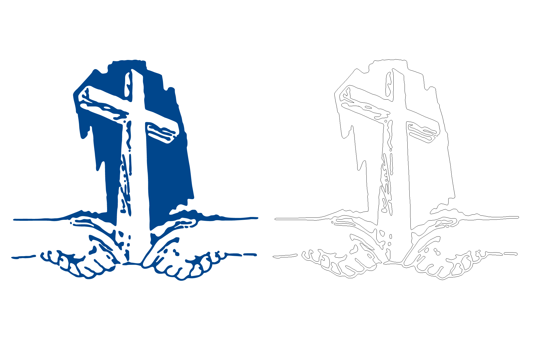
Calvary Chapel Murrieta.
U.S. Army 506th Parachute Infantry Regiment logos from World War II.
Randall’s Adventure & Training (RAT) emblem.
I found a photo of what appeared to be a 3-dimensional model of a famous house online, perhaps made of cardboard and painted. I recreated the house in the same look, using Illustrator, to frame and hang on the wall in my house during Halloween. I used the same colors/gradients as were depicted in the original.
Outlines view of my 112 Ocean Ave. vector recreation drawing : )
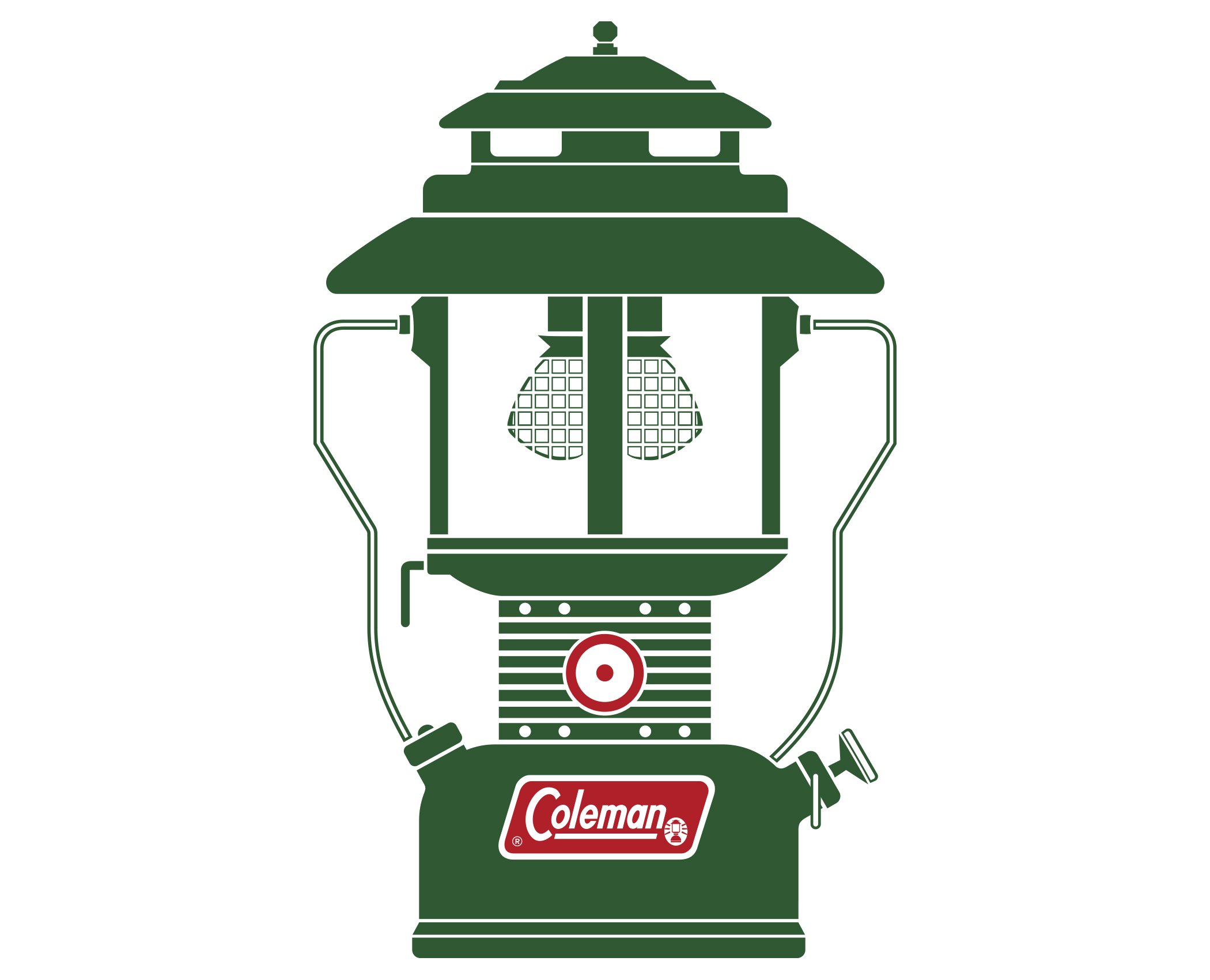
This simple lantern design was featured on the side of Coleman® lantern boxes in the early 1970’s. It’s one of my favorite graphics out of the 1970’s - simple, effective, eye-catching. Just two colors on the side of a cardboard box that really stood out.
The Coleman® logo here is a little different than the modern logo (displayed towards the top of this page). I altered that logo significantly to create this older, circa 1970’s logo. This drawing took more time than I had originally anticipated due to creating the logo and the lantern mantles.
I reproduced this as faithfully as I could and included the inaccuracies seen on the original graphic. Artwork and outlines views shown here.
Reproduction of sides 1 & 2 of a 1970’s Coleman® lantern box. The lantern pictured here is a little different than the first model I drew, shown above. That drawing was altered a bit to make the variant shown here.
The font I used for “220H195” and “TWO-MANTLE GREEN” is Helvetica Compressed, although that wasn’t an exact match.
Sides 3 & 4 of the lantern box. I wish modern packaging was this simple and effective. Personally I think less is more, and modern packaging is often a mess and just plain unattractive.
Various logos I’ve reproduced by drawing them in Illustrator (no trace features were used). As stated at the top of this page, none of these are my design or idea and are shown here simply to demonstrate my ability to reproduce a vector file when one is needed.
The option to override automatic detonation will expire in T-minus FIVE MINUTES.
And remember, if you're going to detonate the Nostromo, watch out for that electrostatic damage to the components when you initiate the scuttle procedure. And for your convenience, the procedure is available in French. Although it's my understanding those instructions are incomplete.
Emergency Destruction System signage from the film Alien (1979) reproduced with Adobe Illustrator (not my design). I did my best to reproduce the sign seen in the movie ... that included less than appealing kerning and a wide variety of horizontal scale and tracking of letters, words, and sentences. I took a picture of my own hand and used it for the drawing of the Electrostatic Damage symbols. Neat.
Various civilian and military aircraft warning & emergency markings.
Why not?
Marketing and branding.
I’ve designed and built hundreds of title & real estate industry print and digital media pieces including flyers, advertisements, booklets, brochures, business cards and more, as well as many support files (forms, forms, and more forms, etc.). To see more samples from this category, please click on PORTFOLIO in the menu at the top of this web page to view my portfolio.
All marketing displayed here was built using InDesign, with Photoshop and Illustrator used for some portions. Stock art is commonly used in FNT marketing.
Fall stuff 2025, Photoshop & InDesign.
Prop 19 Full flyer 2025, Page 1.
Prop 19 Full flyer 2025, Page 2. Page 3 is just as boring as Page 2, so I didn’t post it.
Cover page of an 18-page booklet. Each cover is personalized for the Sales Exec and their territory. HERE’s a sample of the completed booklet.
Arrows created/drawn in Illustrator, all else InDesign. May 2025.
The cover page from my “Sales Executive Booklet.”
Page 2 from my “Sales Executive Booklet.”
FNF Financial Highlights from my “Sales Executive Booklet.”
Page 4 from my “Sales Executive Booklet.”
Page 11 from my “Sales Executive Booklet.”
Page 12 from my “Sales Executive Booklet.”
Page 14 from my “Sales Executive Booklet.”
Page 23 (final page) from my “Sales Executive Booklet.”
Who knew that sections of land could be so much fun?
Both sides of an 8.5” x 5.5” postcard.
A marketing piece made for a sales executive and her team in San Diego. Main photo is from iStock; made with InDesign.
Business card design, 2024.
New business card design, front & back. Illustrator & Photoshop, June 2022.
Business card design.
Business card design, FNT. Illustrator used to draw elements; cards set up in Photoshop.
Business card design.
Two flyers from my Solaris Escrow (Palm Desert & La Quinta, CA) series. The Solaris Escrow logo is also my design.
Recorders Office Holiday schedule 2-ups (8.5” x 5.5”). This is an upgraded design from the one I made late last year. InDesign.
“Two-up” Realtor tent cards for display at an open house. 2019 design.
“Two-up” Realtor tent cards for display at an open house. 2022 design. I just can’t get enough of that cat.
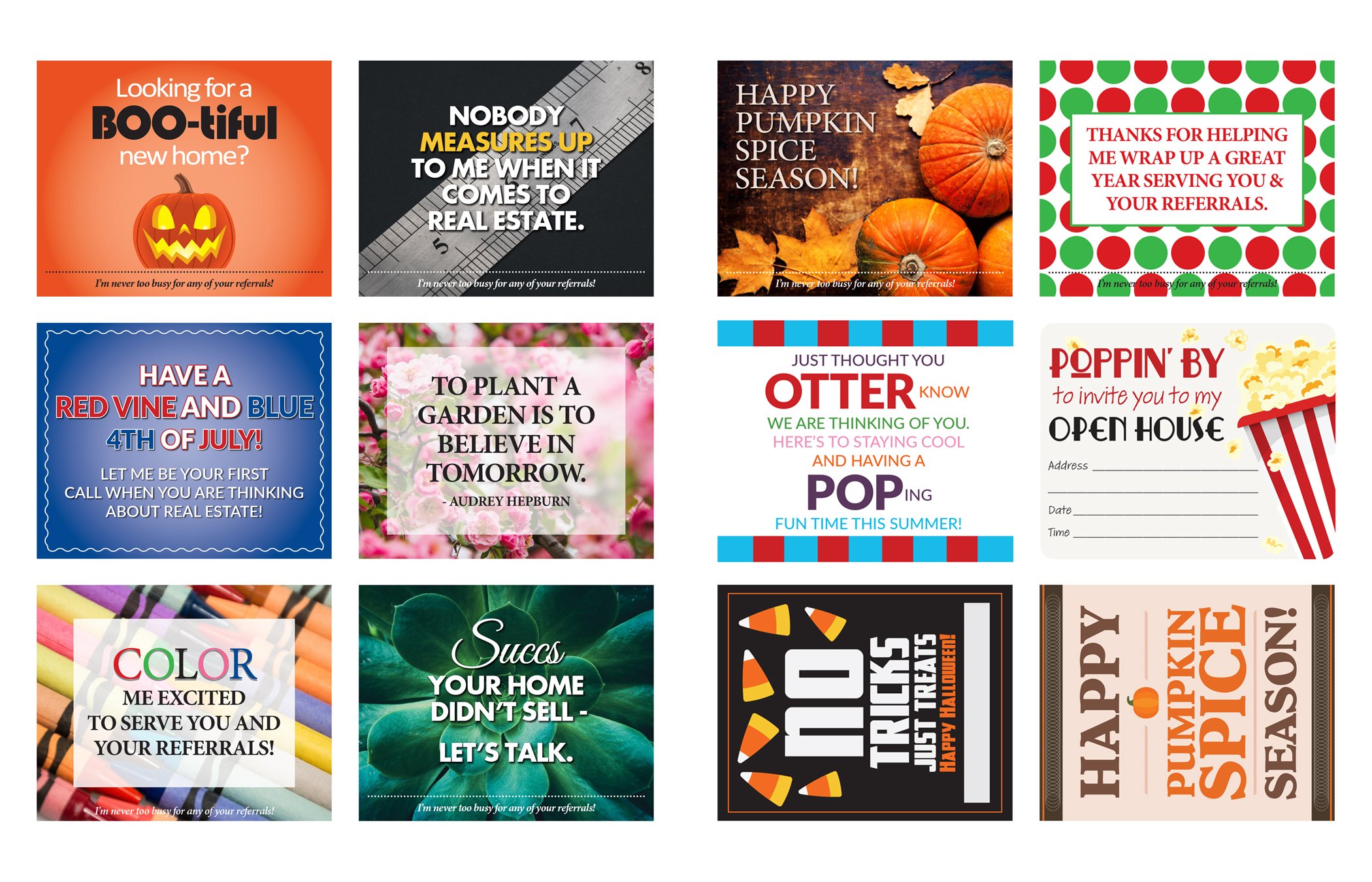
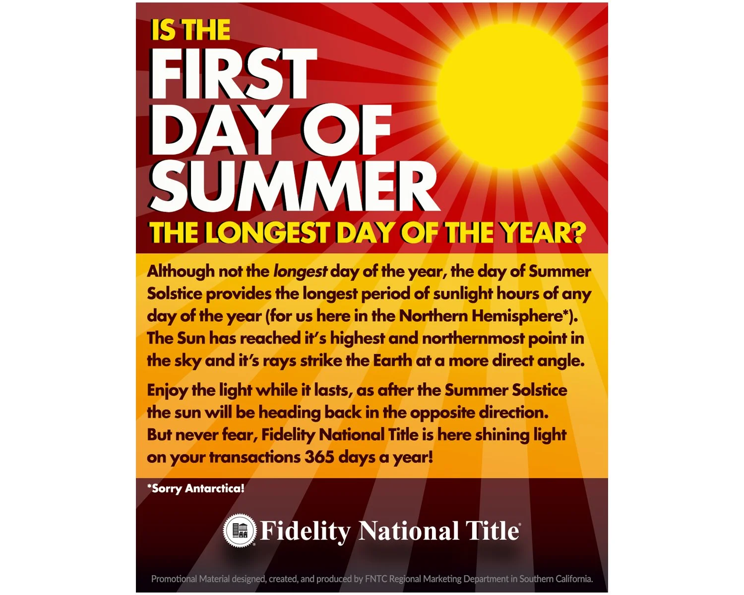
Seasonal “Two-ups.” These are a tradition in the company and have been popular with the Sales Execs for years. A photo or art is chosen and then a design is purpose built around it. Size is 8.5” x 5.5”.
Seasonal “Two-ups.” These are a tradition in the company and have been popular with the Sales Execs for years. A photo or art is chosen and then a design is purpose built around it. Size is 8.5” x 5.5”.
Seasonal “Two-ups.” These are a tradition in the company and have been popular with the Sales Execs for years. A photo or art is chosen and then a design is purpose built around it. Size is 8.5” x 5.5”.
Marketing and branding.
To see more samples from this category, please click on PORTFOLIO in the menu at the top of this web page to view my portfolio.
All marketing displayed here was built using InDesign, with Photoshop and Illustrator used for some portions. Stock art is commonly used in FNT marketing.
Arrows created/drawn in Illustrator, all else InDesign. May 2025.
Custom-made for six SoCal counties every month. InDesign.
2026 Design. Not all dates are final. 100825, InDesign.
Reverse of the San Diego County version of the above. 100825, InDesign.
Two-up for 2024. Photoshop and InDesign.
Two-up for 2024. Made with Illustrator and Photoshop.
2025 Contact Card. InDesign.
8.5” x 5.5” Intro Card.
8.5” x 5.5” Contact Card.
Left: Yearly calendar with Recorder Holidays. Right: Monthly calendar for a sales executive in the Palm Desert region.
Samples of my design for the FNT “Mosaic” flyers.
Samples of my design for the FNT “Mosaic” flyers.
To see more samples of my FNT “Mosaic” marketing click HERE.
The 8.5” x 11” ad on the left was made for FNT San Diego. A companion social media version was also made with limited text. The 7.5” x 10” ad on the right was for Executive Agent Magazine, May of 2020.
FNT SD in-house company retreat flyer. Photos are from the resort’s website.
I incorporated six squares into the design on the left, which represent the Six Fundamental Precepts of the company I work for (FNT). The page on the right is not my design but was reproduced/laid out by me using InDesign. The finished piece was a letter size booklet with multiple pages, professionally printed on 11 x 17 stock.
A couple things made for the FNT San Diego 2020 Sales Awards. 8.5” x 11”.
“Pop-By” six-up tags. These are attached to some sort of complimentary item like candy, a small plant, etc.
“Four-ups” made for FNT. I’ve made hundreds of these on various subjects over the years. Size is 5.5” x 4.25”. InDesign/Illustrator/Photoshop.
Two-up (5.5” x 8.5”) “Getting Started In …” community phone cards, InDesign.
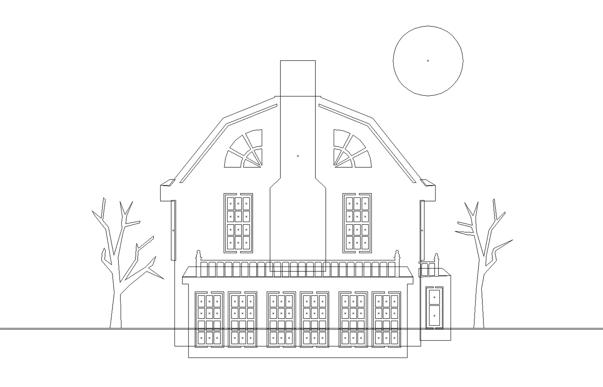
Halloween two-up with “Amityville” house. The house was drawn by me with Illustrator (reproduced; not my design). To see more on the drawing, click on VECTOR REPRODUCTION on the main page of the website.
Two-up (8.5” x 5.5”) card. The goal here was to reproduce the look of the opening credits of the film Psycho (1960) for this Halloween marketing card.
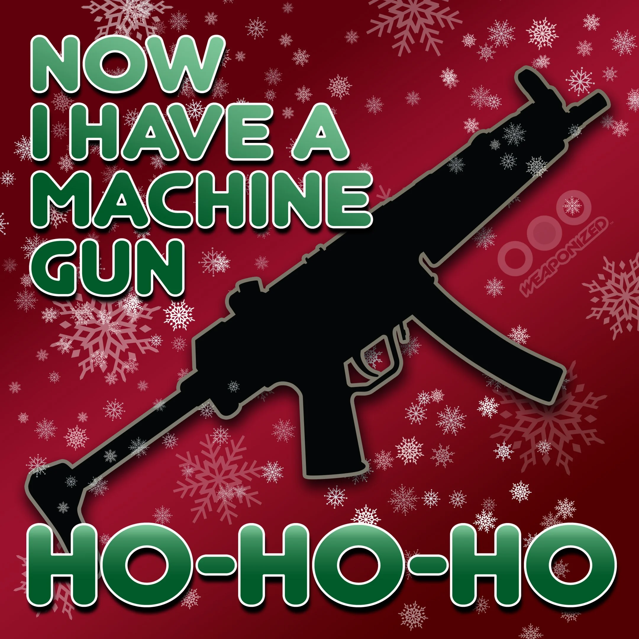
Drawn with Illustrator (except the snowflakes, which were vector stock art). The idea here was to go retro 1960’s, but not sure if it worked.
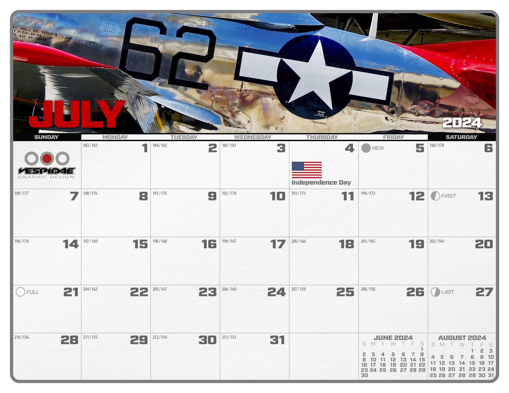
2022 desk calendar header. File is 22” x 3.5”, made with Illustrator and Photoshop.
2025 desk calendar header. File is 17” x 2.75”, made with Illustrator.
Logo & Emblem Design
All logos and emblems displayed here were drawn with Adobe Illustrator.
For additional logo samples, click on PORTFOLIO on the top of this web page to view my portfolio.
"Melee" logo, 2015.
Consolidated Steel logo. The corporation is long defunct; logo is fictional. “Pumpkin bomb” drawn with Illustrator. August 2020.
My personal Graphic Design company logo. For an explanation of the Vespidae logo, please click on PORTFOLIO at the top of this web page to view my portfolio.
I ripped off my own logo. Because, that’s why.
M3 logo, created 01-04-18.
The black widow spider in this logo was drawn based on a photo I took of the spider in my back yard: HIDEOUS
Red Cloud logo, made for my 'Art Deco' train drawing.
Photoshop effects added.
Part of my “Robot Vodka” beverage label design.
Why would you use anything substandard? Especially when Standard is forged on a mountain with lightning. Because, Standard.
U.S. Air Force Global Strike Command / 509th Bomb Wing emblem. This is not an actual USAF emblem; fabricated by me for the pure enjoyment of design and to hone my skills.
I've long admired the simple, subdued gray logos and emblems on modern U.S. military aircraft, and designed this emblem in that fashion...
Spear tip: Represents a first strike purpose and capability
Oval: Represents a path around the globe, showing the reach of the aircraft
B2 Spirit bomber outline: The aircraft itself and the heart of the mission
Lightning bolts: Represents the speed, power, and shock of the strike
6 stars: Represents the six continents where the aircraft can strike (we probably won't bomb Antarctica. It's the neutral zone, and of course, has many friendly penguins).
Logo Design
All logos displayed here were drawn with Adobe Illustrator.
For additional logo samples, click on PORTFOLIO on the top of this web page to view my portfolio.
A logo I designed for an early satellite imagery farming program for FNT.
One of three “Bubble Tea Central” logos designed for a new store in Sparks, Nevada.
One of three “Bubble Tea Central” logos designed for a new store in Sparks, Nevada.
One of my three submissions for a 2016 "Cola Warrior Texas" logo contest.
Some years back I wrote a few ridiculous fictional stories about President Grover Cleveland and his adventures in the years before he became President of the United States. I concocted this fake logo for a fictional organization that supposedly preserved forest land where Cleveland’s early escapades took place. The logo stands as a testament to ridiculous fake history.
Photoshop effects added.
Despite it's apparent simplicity, this was one of the more complicated pieces I've drawn. Made for a Navy Corpsman who is now a medical professional in a civilian setting. The logo was placed on a business card when finished. Some Photoshop effects added and shown here. Inception and Design: Edith Hartmann; Illustrator and Photoshop work by me.
This one I made as a joke a few years back. A friend had a job in Lake Arrowhead and one of the duties he got stuck with was to remove ‘waste’ from a resort swimming pool. The acronym stood for TACTICAL • URBAN • REFUSE • DISPOSAL or some such nonsense. I can’t remember, but it was no doubt something gross. Looking back it’s actually kind of a cool design, and would look nice as the shoulder patch on an OD green uniform shirt.
Three Laura Aguilar options.
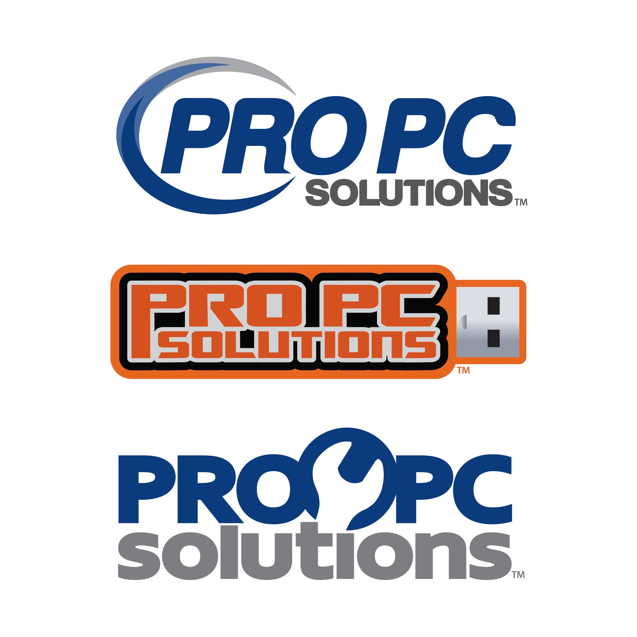
Three Pro PC options. The top version was chosen.
Three Title Fit options. None were chosen.
Three Solaris Escrow options. The middle version was chosen and was used from 2011 to 2021.
Solaris Escrow operated two offices in the low desert of Southern California for ten years, one in Palm Desert and one in La Quinta. As of 2021, Solaris is part of Fidelity National Title.
Solaris logo sign at the entrance to the Palm Desert office in 2014. Solaris Escrow is now part of Fidelity National Title and the name and logo are no longer in use.
Multifactor authentication logo created for “Tools” marketing with Fidelity National Title. Although not a true logo, this one’s logo-ish so I’ve included it here.
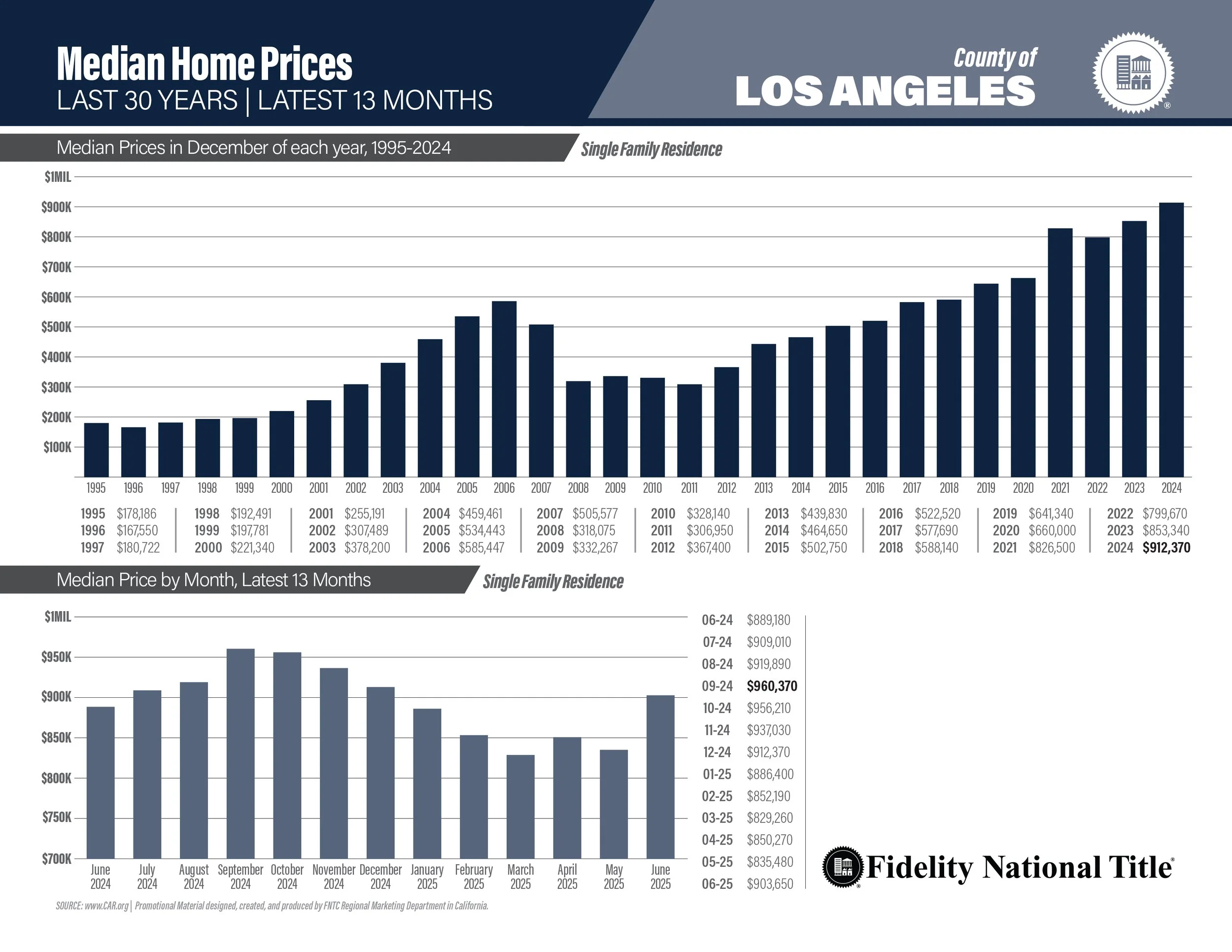
Graphicly structured facts, info, lists, inventory, guides, etc. Made with InDesign unless otherwise noted.
2” X 4” equipment box labels.
Infographic made with Illustrator.
Map drawn for the “Location” page of a 25+ page booklet. Illustrator.
Signs made with Illustrator and/or InDesign. Made for need, fun, and in some cases so hilarity will ensue.
Reproduction of a sign on a modern US Navy warship. I altered the individual letters on the piece as I couldn’t find a font which matched this particular stenciled look. Not my design; this is a reproduction.
Aircraft warning & emergency markings. Not my design; this is a reproduction.
Reproduction of a sign found on sensitive US Military installations. Not my design; this is a reproduction.
Reproduction of a sign located in the San Bernardino National Forest near Lytle Creek in the 1980’s and 1990’s. Not my design; this is a reproduction.
Not my design; this is a reproduction.
Slightly different than the version above. Will anyone notice?
Nothing else I’ve ever designed comes close to the perfection and spectacular nature of this artwork. Ready for retirement, yes sir.
Not my design; this is a reproduction.
Graphics made for social media posts. These are primarily created with Photoshop, but support elements are sometimes created with Illustrator.
New employee announcement. Slide 1 above, Slide 2 below. Photoshop & Illustrator.
Social testimonial post, slide 1. Slide 2 below.
Graphics made for social media posts. These are primarily created with Photoshop, but support elements are sometimes created with Illustrator.
I didn’t draw this spooky scene, it was an iStock vector purchase.
This is NOT our final address or the actual date of the move. Those are yet to be determined.
Misc works. Photoshop, Illustrator & InDesign.
2025 email signatures.
2024/2025 email signatures, forerunner to above design.
New design for an ongoing escrow email campaign. The top portion is the header and will be different for every month/subject and contain a link. Bottom portion is the footer with the Escrow Officer’s info. Photoshop.
3” x 5” Range Cards, double-sided; end product is laminated. InDesign.
Buttons for inclusion with email signatures so customers can follow links. Photoshop/Illustrator.
Rendition 2 of a new Property Profile cover. These will be professionally printed on heavy stock and have a die cut for a name/address to show through the cover. Photoshop, January 2023.
Rendition 3 of a new Property Profile cover. These will be professionally printed on heavy stock and have a die cut for a name/address to show through the cover. Photoshop, January 2023.
Updated design (May '24) for personal monthly calendar, InDesign.
Desert Log Cover made with Photoshop; size is 8” x 10.5”. All photos were taken by me.
Extensive Photoshop work was required to fabricate these smart phone graphics.
Sales exec Note Pad file with crop marks for printing. Yeah, I know, this is pretty basic and there’s not much to it. But sometimes as a designer you’re asked to reproduce something the company has been using for years, and they don’t want it changed.
A flyer I did for FNTIE’s Halloween contests.
A fictitious turn-of-the-century citrus industry packing label made with Illustrator and Photoshop.
Illustrator: Riverside City "Raincross" logo (not my design; recreated by me), "Miranda" logo, and the sun.
Photoshop: All effects.
The main oranges w/leaves, the grove, and the mountains were all separate photos I took in Riverside. I combined them into a single image and then added Photoshop effects.
Email update notice for a sales rep.
My Illustrator-drawn beverage label with Photoshop effects added to simulate label texture.
A photo repair project with before and after views. The original 40-year-old photo was very small (about 1" high), scanned at a high resolution.
A San Diego County zip code map I built for Fidelity Title San Diego. The only portion I did not draw was the outline of the state of CA on the left (it was part of a vector stock art purchase).
Close-up of my San Diego County zip code map.
“The Headless Gunman.” Photoshop work I did a few years back for Halloween.
Traditional art - pencil
All black & white drawings displayed here are pencil on paper or poster board. The color drawings are Berol Prismacolor pencil on poster board.
The Webley revolver is a still life.
This T-Rex is not my 'design' - I drew it based on an existing drawing I found in a magazine about the movie Jurassic Park. A picture in the magazine showed concept art of how the movie T-Rex was envisioned. However, the original design was more one-dimensional and did not show the dino's right arm or leg. So, when drawing this, I fabricated a right arm and leg to give the dino a little more dimension. I also made the head somewhat larger and longer than the original, and the tail longer. This drawing is about 25" long and took about 40 hours to complete.
An old photo I found and scanned showing the T-Rex drawing almost complete.
16" x 20" drawing of a Thompson submachine gun based on a photo I found in an old book.
Detail of the Thompson drawing.
Still life drawing of a Webley .38 revolver. This one took quite a while for me to draw because I wanted it to look realistic, and I'd never done a still life before this.
Detail of the Webley drawing.
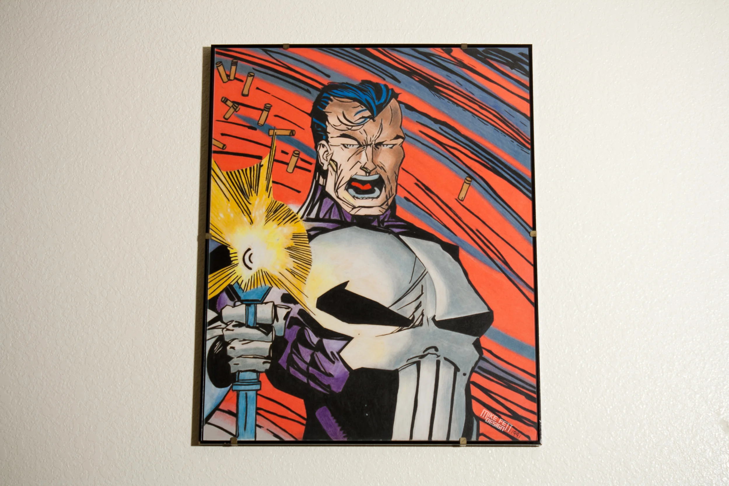
"The Punisher," drawn based on art found on a baseball card sized trading card. Size of finished piece is 16" x 20".
A "Huey" helicopter drawing I made when I was 15 years old.
Detail of the Huey drawing.
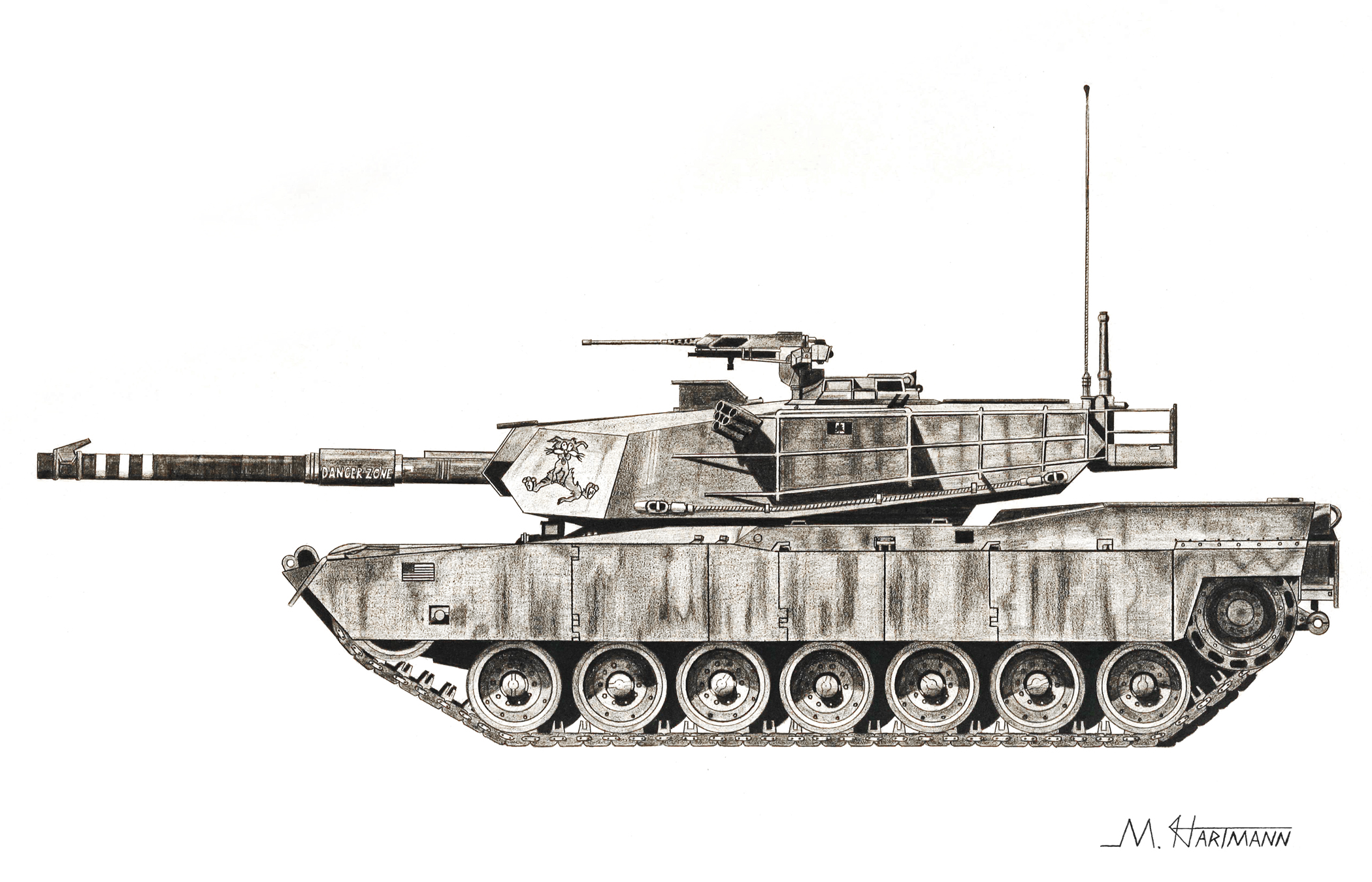
M1 Abrams tank drawing from when I was 20 years old.
Detail of the Abrams drawing.
Chief Sitting Bull drawing, size is about 30" high. I drew this one based on a photo I found in an old Time Life book about the American West.
Sitting Bull eye detail.
Sitting Bull clothing detail.
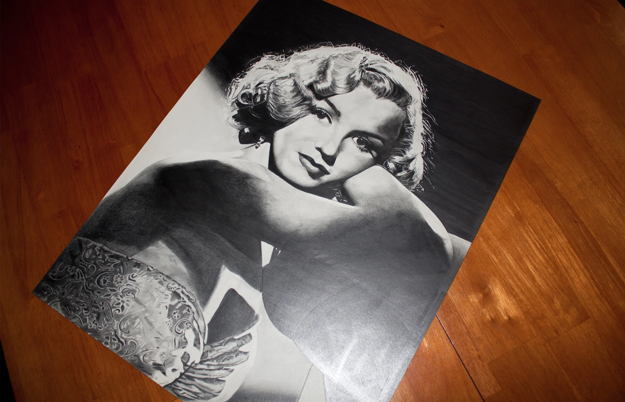
Norma Jean Baker, Marilyn Monroe. I found a postcard at the Riverside mall which was about 4" x 6" and based this drawing on that. Size of finished art is about 30" high by 20" wide.
Norma Jean Baker drawing face detail.
High school art class drawing/painting I entered into the annual contest for high school students at the end of my senior year. I won some sort of prize for this one, and the Riverside Unified School District also purchased the art for display at their Riverside headquarters. This entire project was the idea of my high school art teacher, Louis Fox. I drew the horse statue first, then Mr. Fox wanted me to paint the chair over it, which I thought ruined it. In retrospect, I kind of like it. Size was about 48" wide by 30" tall.
Another senior year high school art drawing. This one was also purchased by the Riverside School District at the end of the year. Size was about 48" tall, pencil on canvas.
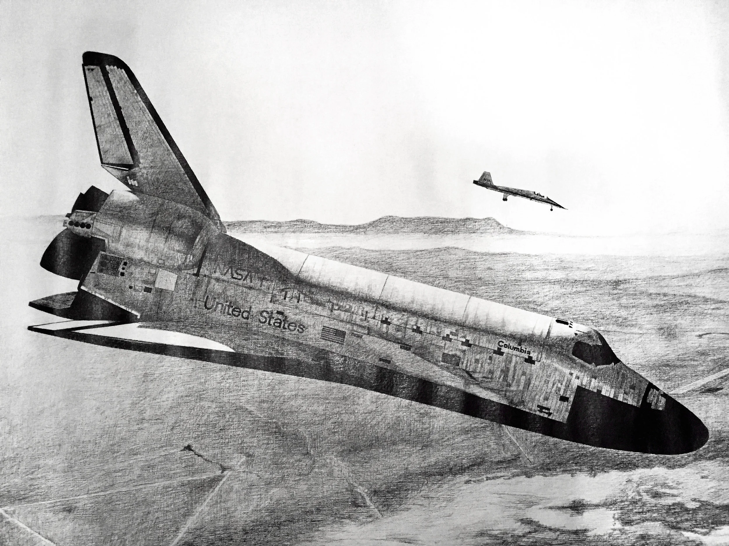
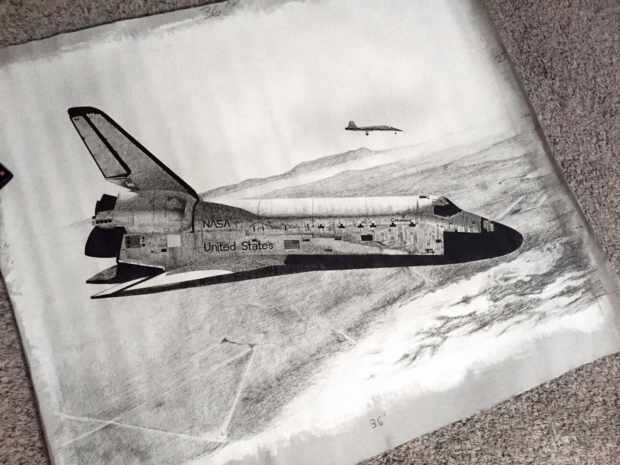
Space Shuttle Columbia drawn when I was a senior in high school. Size is 36" x 27", pencil on canvas.
Space Shuttle Columbia drawn when I was a senior in high school. Size is 36" x 27", pencil on canvas.
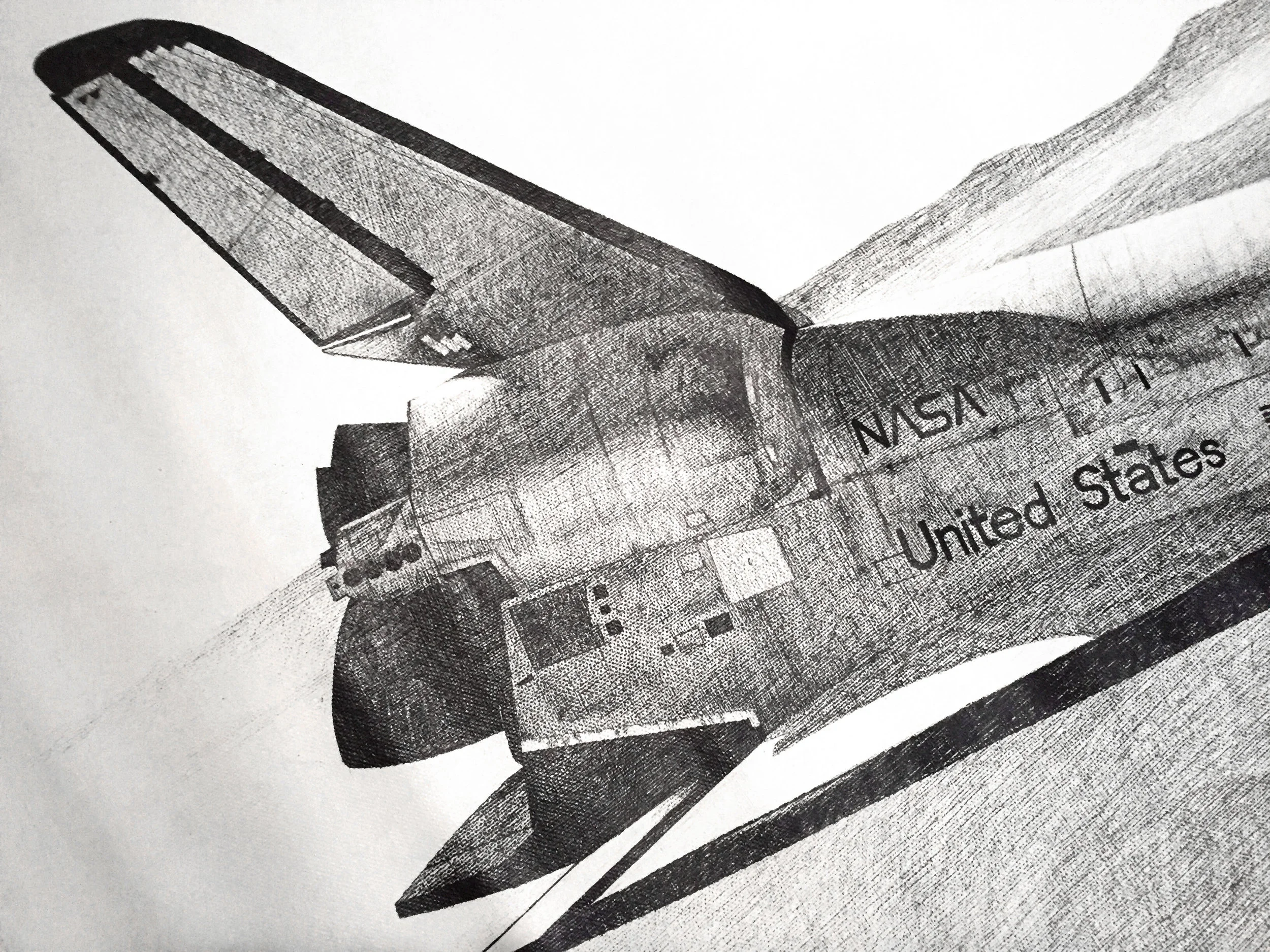
Detail of Space Shuttle Columbia drawn when I was a senior in high school. Size is 36" x 27", pencil on canvas.
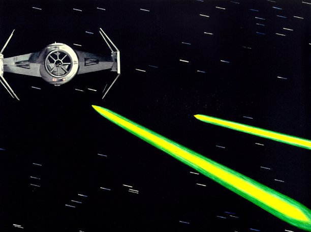
Vader’s TIE Advanced,* colored pencil on posterboard.
* Contains more advanced advancements than the standard model
This website is an online portfolio only. Please email comments or questions to Mike Hartmann at: mike_hartmann@charter.net
UPDATED 330 • 2025


